Case Study
A custom dashboard for
tracking donations, donors,
and other metrics for a local Non-Profit.
Homeless
& Human
Project Overview
-
Role
UX/UI Designer, UX Researcher,
Brand Designer -
Who's In the Party?
Myself, Homeless & Human Board
and Financial Teams, Dev Team -
Length of the Quest
1 month (Jan-Feb 2023)
-
Tools
Figma, Miro, MUI Design System
The Problem
Homeless & Human’s current system of information tracking is non-centralized. This limits the number of people that can keep important information such as donors, donations, and volunteers up-to-date and accurate.
The Goal
The goal is to create a simple system that allows multiple members of the organization to track information while having it compiled in one place.
The Solution
Create a custom dashboard for Homeless & Human that allows for the collection, tracking, and distribution of data from multiple parties.
DISCOVERY
Research
In order to get a clearer picture of products already on the market, I looked at 4 companies. In comparing these products I was able to get a good view of what features seem to be standard for dashboards as well as what might be helpful components for Homeless & Human’s dashboard to have.
☺︎ Strengths
A board member already has an account and
product knowledgeCan pull data from other sources
☹︎ Weaknesses
Portions become confusingly “ala carte”
The demo is hidden behind a sign-up
Possibly cost-prohibitive for the full board
☺︎ Strengths
A board member has experience with this product
Easily customizable
Generated reports are simple to understand
and visually appealing
☹︎ Weaknesses
Multiple connections could cause confusion
The demo is hidden behind a sign-up
Pricing is also unclear and “ala carte” pieces could bloat the cost
☺︎ Strengths
Can export professional reports
Easily customizable Professional Account Support
Can use code to place into other interfaces
☹︎ Weaknesses
Does not seem secure compared to
other platformsIt was hard to see how the product truly
worked. Would need a demo.No native application
☺︎ Strengths
Quick and Secure
Access is granted to all Zoho apps and
third-party extensions.Integrates well with Quickbooks
☹︎ Weaknesses
Could be cost-prohibitive for a smaller
non-profitData importing could be challenging
The demo is hidden behind a sign-up wall
Takeaways:
Most of the products on the market had the ability to pull data from other sources and create a dashboard and/or report from it.
A lot of the other products had full demos hidden behind sign-ups which prevented me from seeing much more than the basics.
Most valued some level of data security but surprisingly a few not listed above lacked decent support and security.
Qualitative Research
Over the course of a week, I interviewed 4 targeted board members. These interviews focused specifically on 2 members of the financial team and the Dev team who’d be building the product.
Getting to Know the User
“We have a lot of information coming in from a lot of different places. We need to be able to work smarter, not harder.”
Key Takeaways
1.
Secure/Private
All of the participants agreed that due to privacy laws, it was imperative to have multiple levels of password-protected visibility for the dashboard.
2.
All in One Place
Multiple members said they wanted the dashboard to have “everything all in one place” so they didn’t have to use multiple systems.
3.
Team Effort
Members also stressed the need to have all members contribute despite varying security levels. Editing capabilities would also be spread among a few rather than all or one.
User Personas
Once all the data was collected and mapped, I created two user personas to represent the users that I had interviewed. These personas helped me to keep the user at the forefront of my designs.
User persona for Christie, the financial expert. One of two personas created out of data collected.
DEFINE
Journey Mapping
In order to visualize pain points in the process and find additional ways to improve the user’s experience, a journey map was created of both the current methods used as well as a potential future state.
Once the maps were created they were presented to the client, and they corroborated the the current process and approved the next steps.
User Flows & Feature Sets
Using the data collected along with additional feedback from the client, a prioritized list of features was created. Tasks chosen for the MVP prototype were - importing a new document, adding the information to a company dashboard, and sharing the dashboard.
DESIGN
User Interface
Sketches & Low-Fidelity Wireframes
After a preliminary round of sketching, selected screen concepts were moved into Figma and developed further with greater consideration given to sizing and hierarchy.
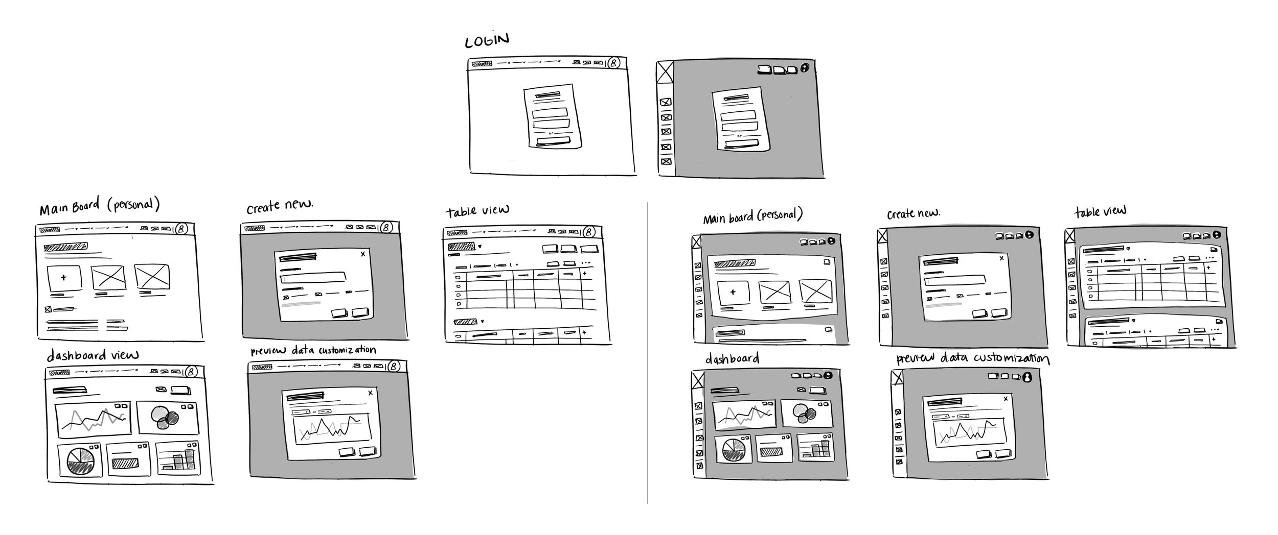
Rough Sketches of Screens
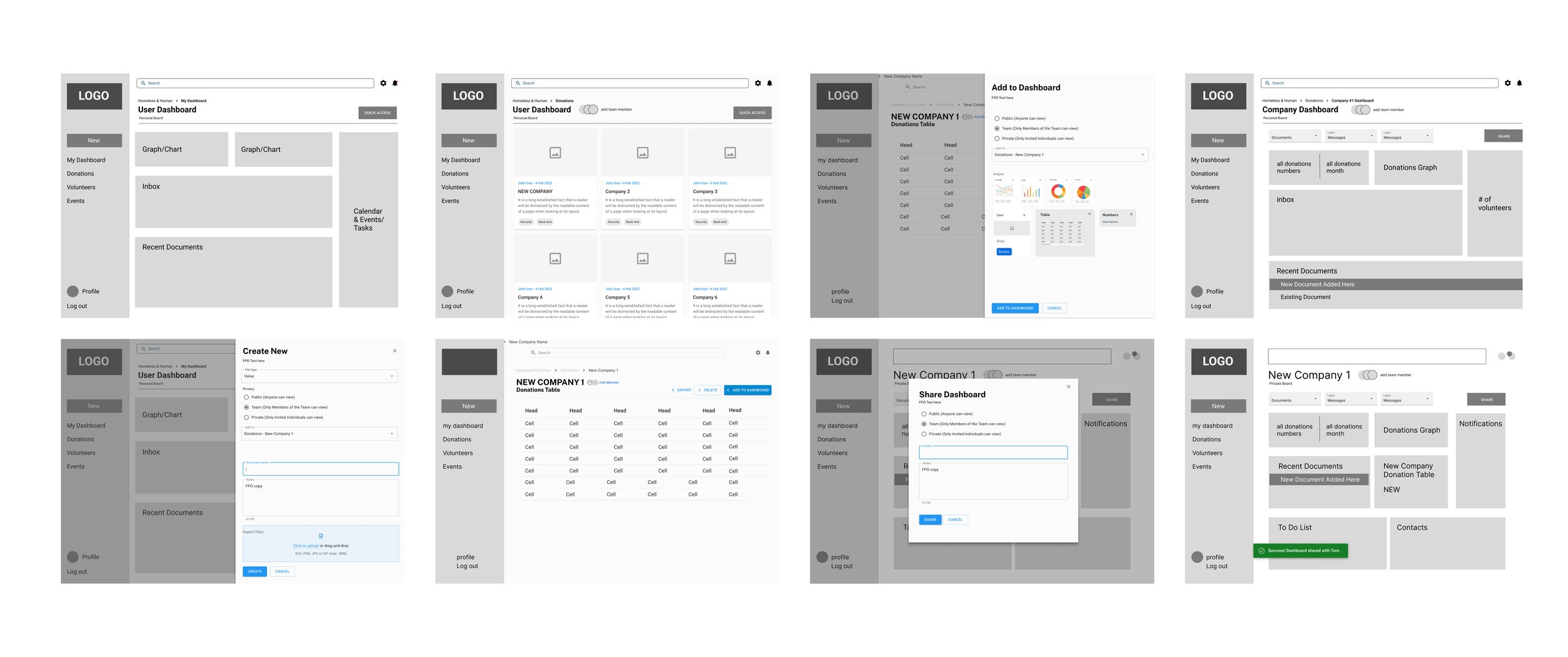
Low-Fi Wirefrmes
Working with Design Systems
Starting versions of logos and color palettes were explored and iterated upon. The logo and color palette are still being refined with the client, however, these were used as proof of concept.
The design system used for the UI is the MUI design system. This was selected after conducting interviews and several meetings with the development team.
Hi-Fidelity Wireframes
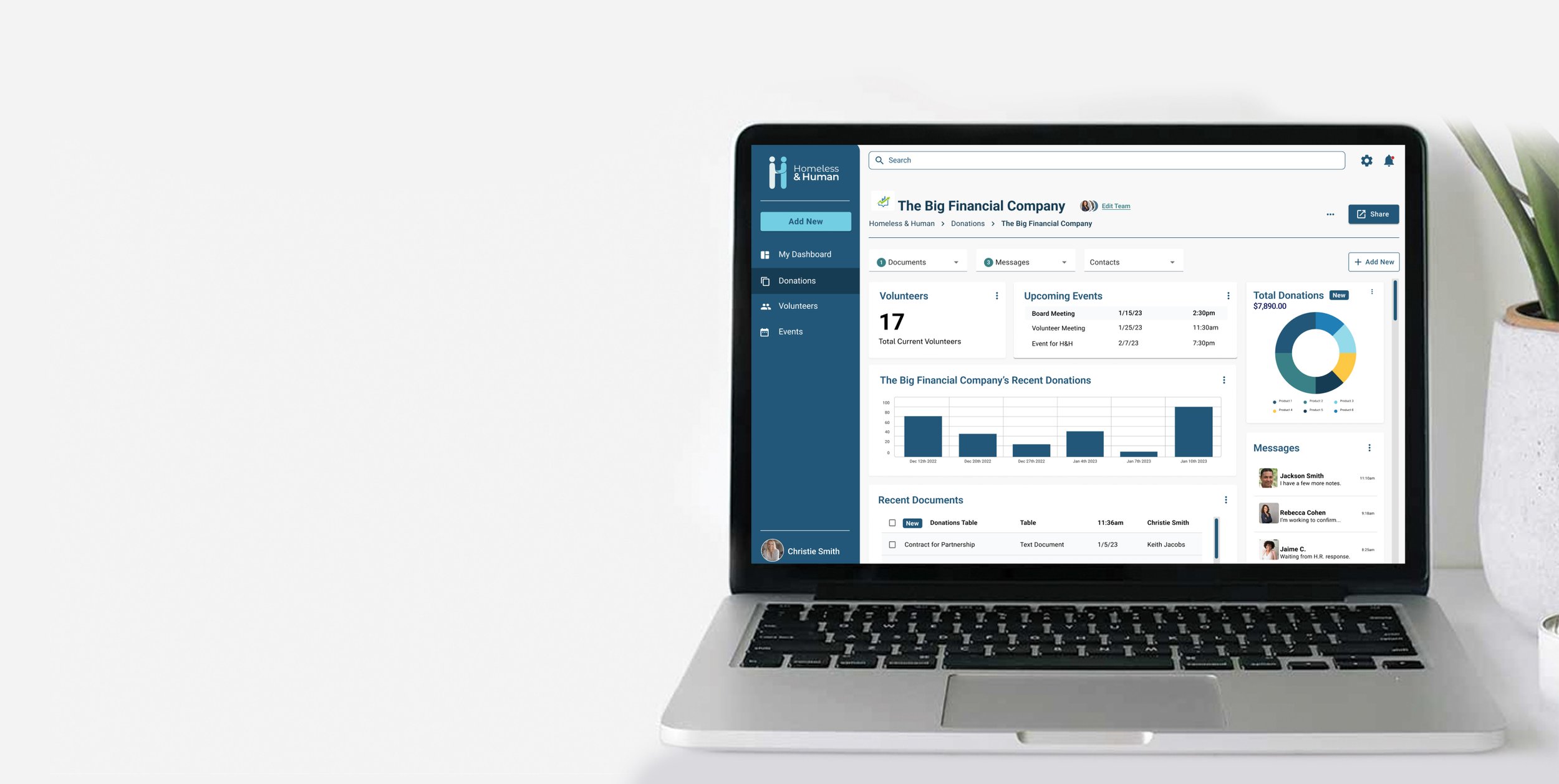
Once branding and UI were established, high-fidelity wireframes were developed, adding color and imagery while making sure to expand and iterate on patterns of hierarchy in order to clearly guide the user to important aspects of the experience.
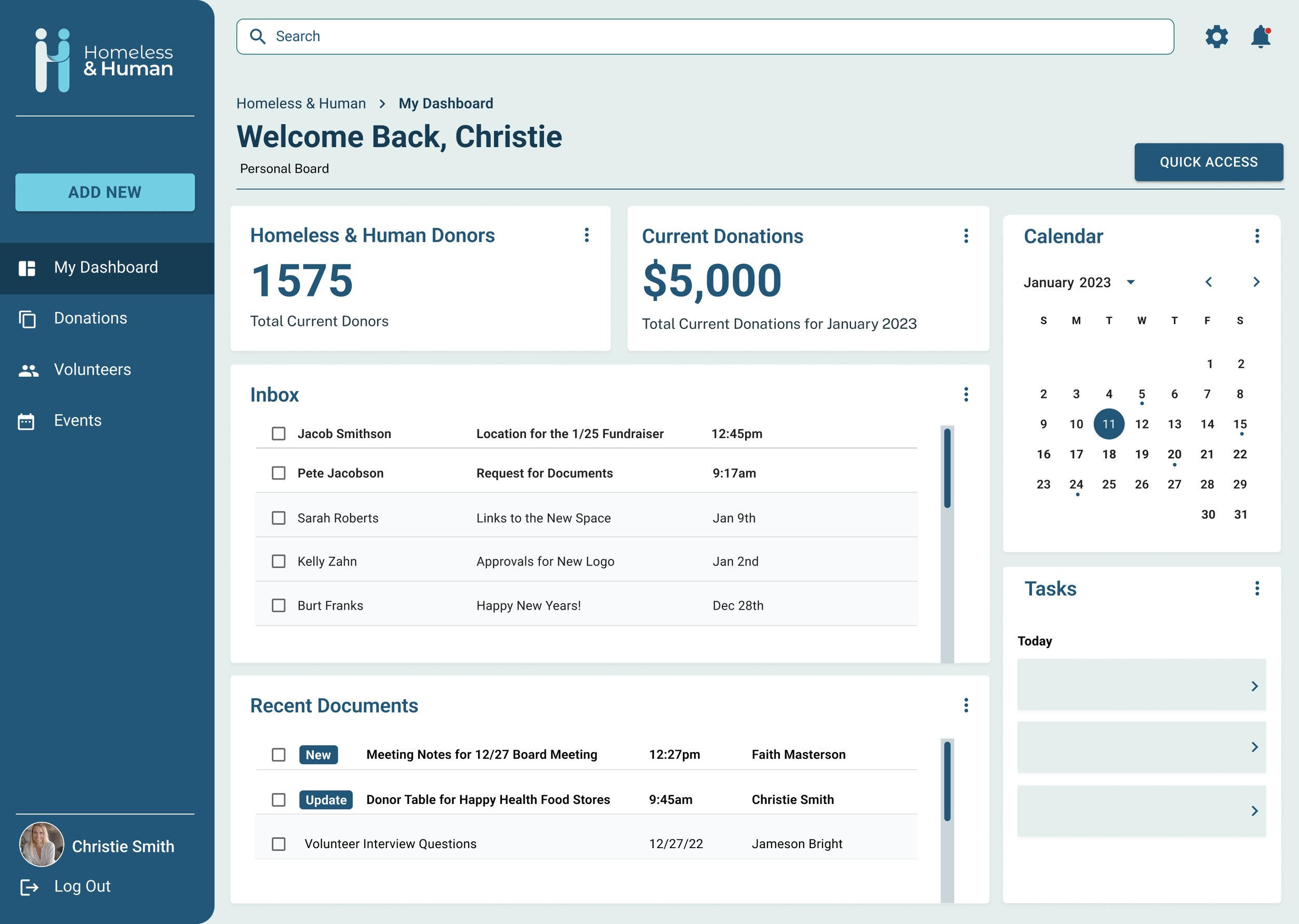
Main User Dashboard (User enters to this screen after log in)
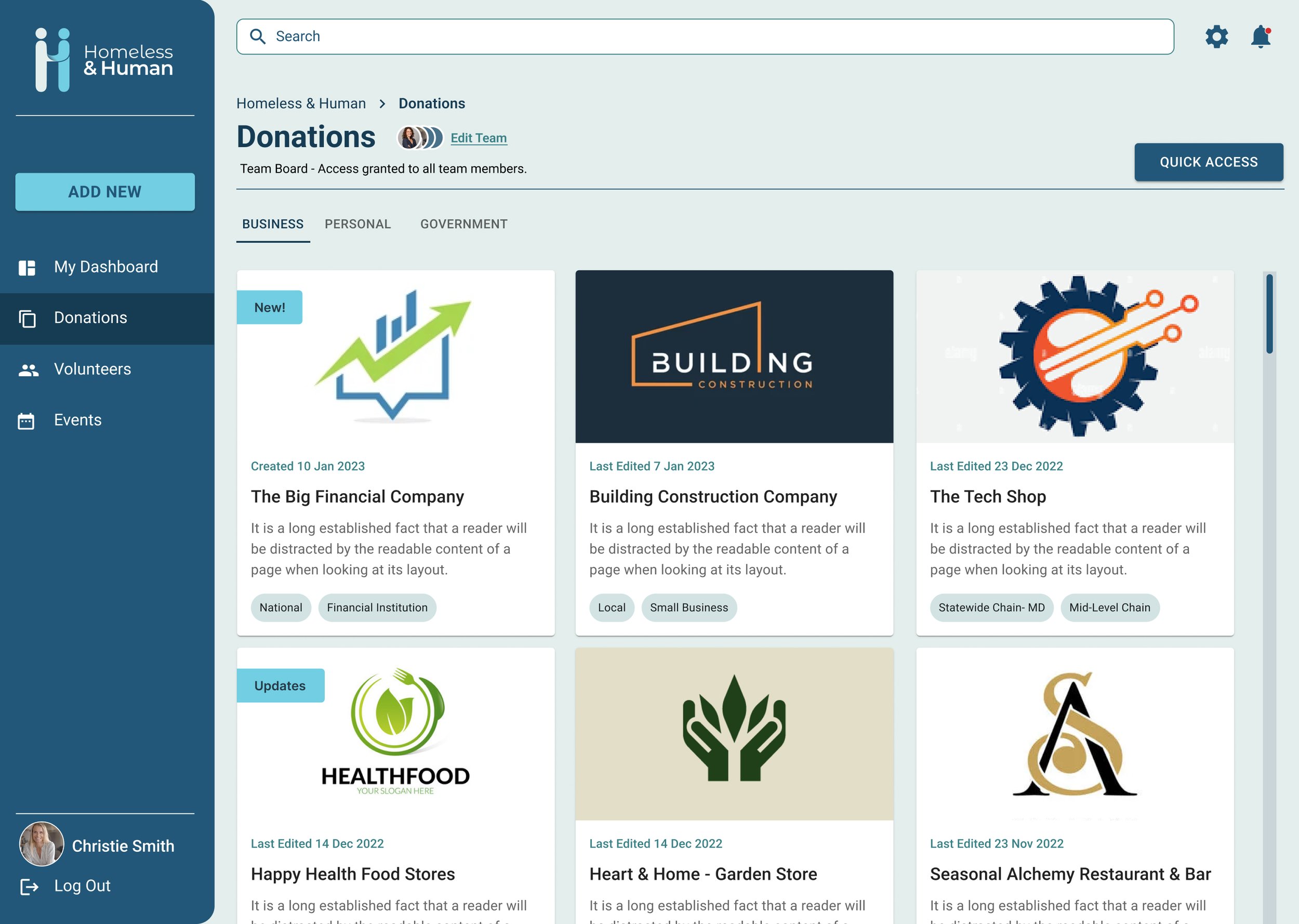
Main Donations Dashboard (Business Tab)
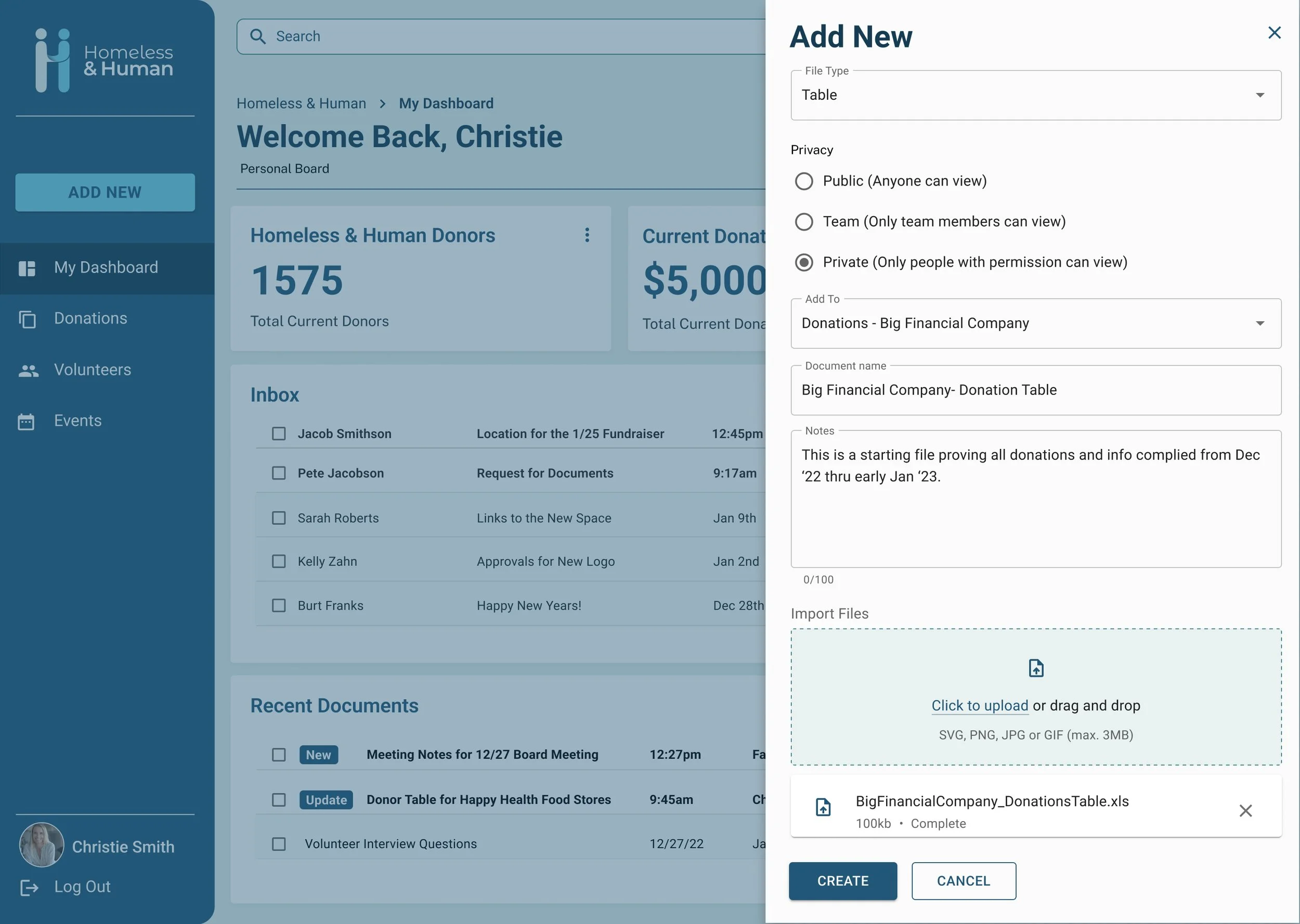
Add New Panel (allows user to add anything from a document to a new Dashboard)
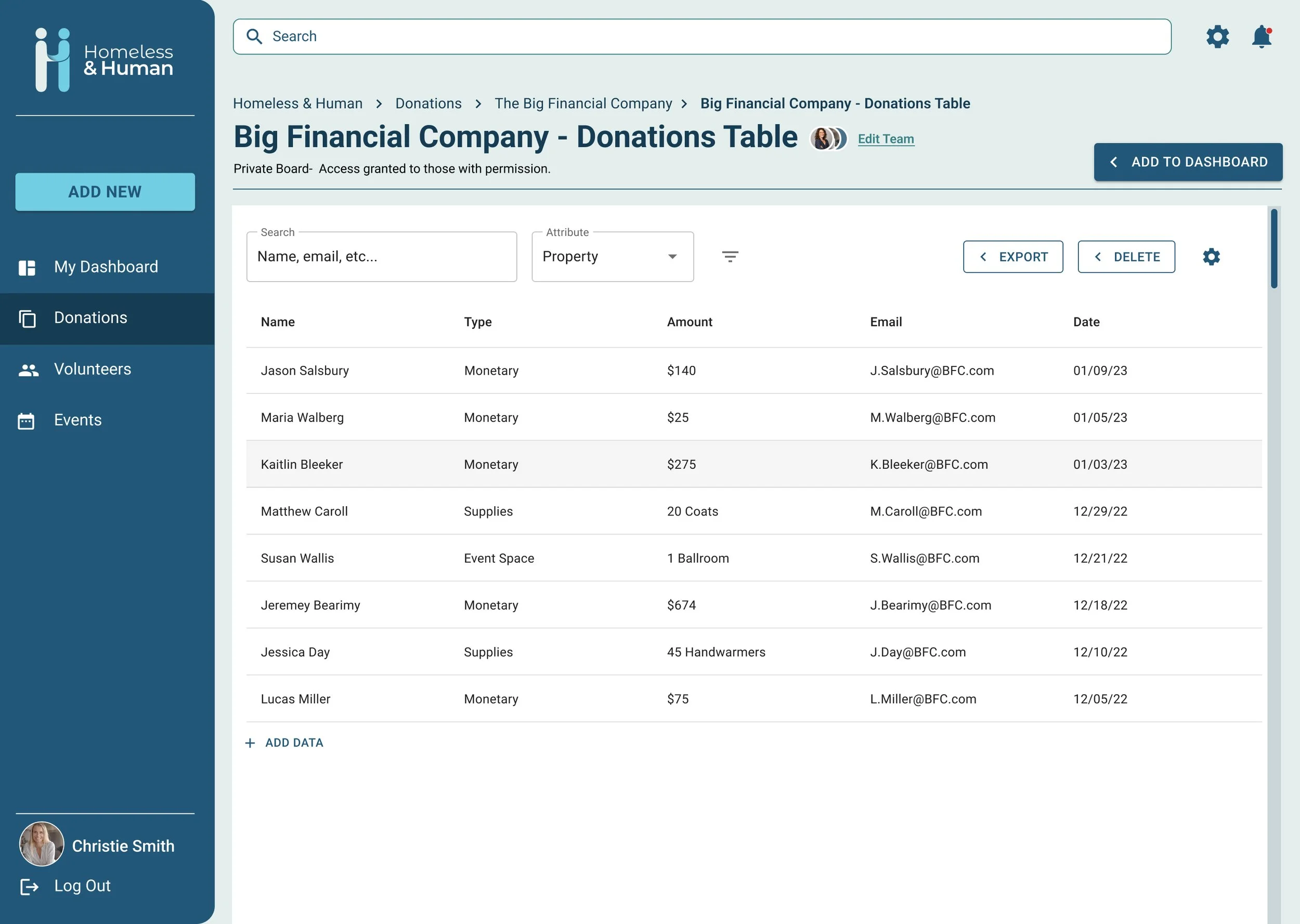
Table from Imported Document
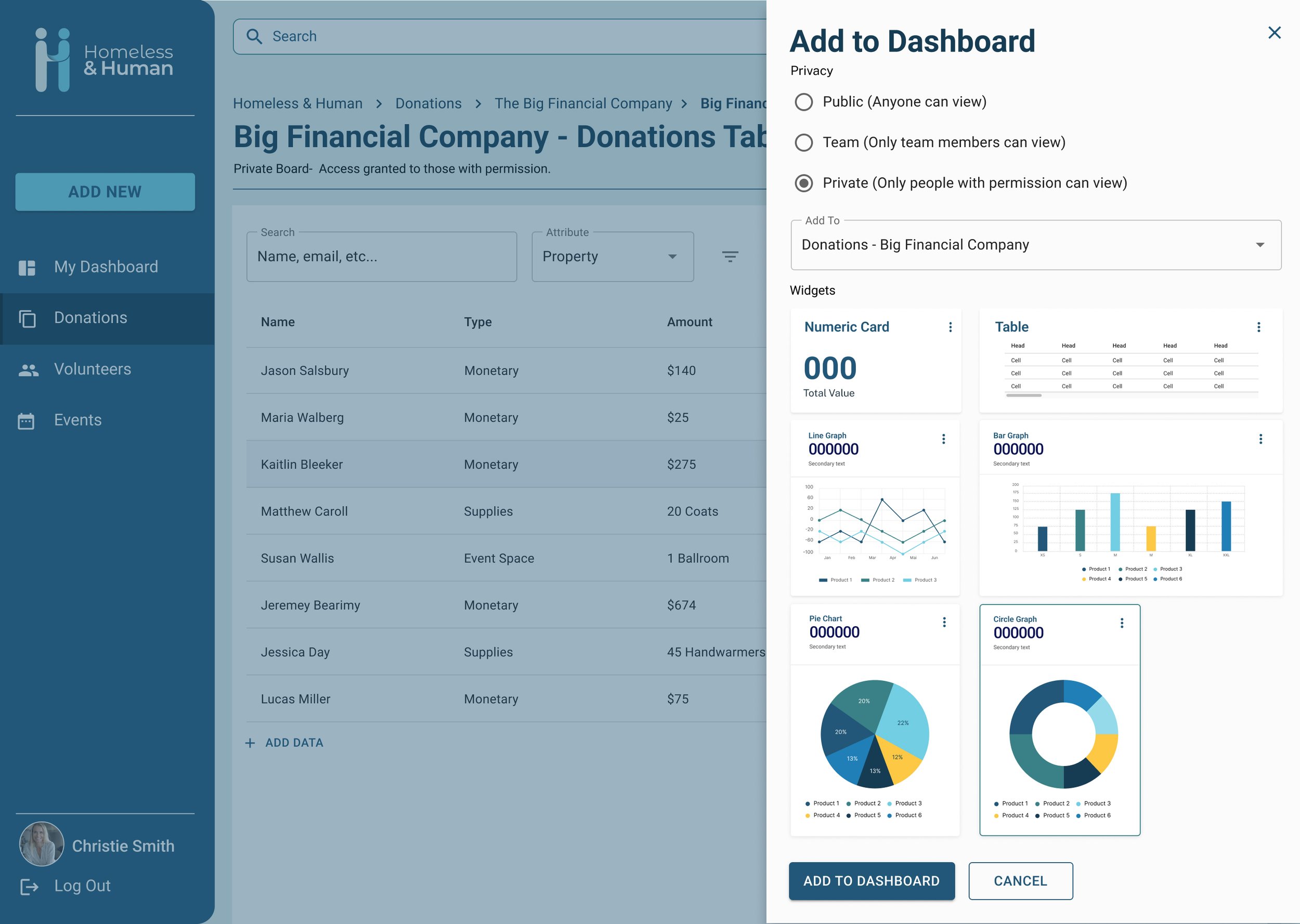
Add to Dashboard Panel
TEST
Prototype & Testing
Usability Testing
There was one round of preliminary user testing with 8 people occurring for the Homeless & Human dashboard. The testing was in-person and virtual testing, with the testers being monitored over Google Meetings as they navigated the experience. 5 out of 8 participants fell into the target market of the Homeless & Human board, while 3 were outside of the project and used as a check.
Key Takeaways
There were two ways that the 8 individuals took to navigate to add a donation. The most frequently used was the static “Add New” sidebar button, with 4 participants using that method. The other method was going through “Donations > Big Financial Company’s Board > Add New” with 3 people.
Several board members appreciated the ability to have tabs specifically for company donations and individual donations. They expressed the visual separation was helpful and made it easier to see what they were looking for.
2 users expressed the need to change the coloration on the graphs to something more contrasting, the blue and green were too close together for them.
All users found the experience intuitive and easy to navigate.
Board members were pleased with how the prototype looks and are looking forward to the final build.
ITERATE
Updates
Change of Terms
Some of the updates were on the minor side but no less important. Members of the board noted that instead of a “personal” donations tab, it should be noted as an “individual” donations tab- because this allows some level of clarity when dealing with public figures.
Adding Helpful Visuals
Another update was made to add additional icons to the buttons in the experience for better visual clarity and to bring the dashboard more in line with other digital standards.
UP NEXT
Takeaways & Next Steps
Takeaways
This project gave me good experience with partnering with a client who possessed an immediate need. It was more time-consuming than I anticipated but I enjoyed working with a group that had an idea of what they wanted, while still giving me the freedom to partner with and guide them on solutions. Learning a bit more about how non-profits operate and the struggles of development teams also gave me insight into how I might partner better with them in the future.
Next Steps
While this first-round MVP prototype is a success, I will be continuing to work with the client to refine the experience, provide assets, and assist the development team in building the live version. The logo and color palette will also most likely be iterated based on feedback provided by the president of the non-profit.


