Case Study
Flock App
A digital app that builds community for parents of neurodivergent children.
Project Overview
-
Role
UX/UI Designer, UX Researcher,
Brand Designer -
Who's In the Party?
Me- with input from my mentor
and a team of designers -
Length of the Quest
1 month (April-May 2023)
-
Tools
Figma, Miro
The Problem
Parents of neurodiverse children can feel isolated and overwhelmed when trying to find resources and social events that fit the needs of their family.
The Goal
Provide a sense of connection for those parents with neurodivergent children so that they feel less alone and create a local community as well as in an online space.
The Solution
Create an app for parents of neurodivergent children, based on their location and interests where users can share their feelings, events, resources, and more.
DISCOVERY
Research
While the market for niche social media platforms is extensive, I found there was a limited market for products catering to those raising a neurodivergent child(ren). While some apps focused on event spaces, resources, or community creation as a whole, there were none that seemed to combine them. Several of the products I analyzed can be seen below.
☺︎ Strengths
Does a good job of filtering and organizing a ton of information.
Has been established for nearly 20 years.
Very heavily skewed towards building community and friendships.
☹︎ Weaknesses
Can be overwhelming.
Not entirely local so friends may be across the country.
It’s a platform for everyone. Not specific to our potential users.
☺︎ Strengths
Helps to build a database of locations and their accessibility
and accommodations for different neurodivergence.Highly intuitive experience.
Very clear iconography.
☹︎ Weaknesses
Data/ratings/info seems determined by only user reviews.
Local places searched had limited reviews despite being very well visited.
Not a lot of data in the app.
Wunder App
☺︎ Strengths
A very in-depth app that has multiple categories and supports/resources for the autism community.
Has videos, articles, and access to forums.
UI and general experience are relatively simple.
☹︎ Weaknesses
Feels very crowded.
Seems to lean very heavily on videos rather than a mix
of articles/videos etc.Feels educational rather than community-based.
NeuroHub App
☺︎ Strengths
Clean and engaging UI and experience.
Caters to different forms of neurodiversity.
Good organization of content (doesn’t seem
overwhelming).
☹︎ Weaknesses
Doesn’t seem to deal with local connections.
Deals more as a support group than real connections.
Feels more academic/life-based.
No event meetup suggestions.
Getting to Know the User
Qualitative Research
Over the course of several days, I interviewed 6 participants who fell into the user parameters. There were two men and four women who had children of various ages and conditions that placed them into the neurodivergent category.
“It can be really frustrating planning to go to events. Without prior knowledge of details, especially sensory considerations, I’m not sure what to plan for.”
Quantitative Research
To further my understanding of potential users and gather additional quantitative data, I also released a Google survey to several parent groups on Facebook. It provided 9 responses that gave further insight into the challenges and current habits of the user.
Key Takeaways
1.
No Surprises
Many of the interviewees and survey participants said they had frustrations and pain points surrounding being surprised with a sensory issue or location issue once at an event.
2.
Resources
Many of the participants had various resources they wish they had earlier. Whether it be school-based, support like childcare or therapists, or for local parent groups - the desire was there.
3.
Community
While participants did not note the specific drive of making new friends of their own, they did note the desire to connect with other members whose children had similar needs as their own.
User Personas
Once all the data was collected and mapped, I created three user personas to represent the users that I had interviewed. These personas helped me to keep the user at the forefront of my designs.
The persona of Franklin. One of 3 personas that encompass all users interviewed.
Storyboarding
In order to get into the mind of a user, I created a storyboard of one of the personas
(Fiona) and how and why she might use the app. This, along with Affinity Mapping and the creation of personas, helped get into the mind of the user.
Information Architecture
DEFINE
Roadmapping
It was important, due to the size of the application, that a site map was created in order to make sure that each of the necessary features were included. After the site map was created, user flows were then developed based on the architecture of the site.
User & Task Flows
User flows were created after determining the desired tasks for the MVP. The flows included login & onboarding, navigating to various feeds, viewing an event, and finding a resource.
Once user flows were complete, more
in-depth task flows were created.
A set of user flows for the MVP. After these were created, task flows were drawn from them.
DESIGN
User Interface
Sketches & Low-Fidelity Wireframes
After a preliminary round of sketching, selected screen concepts were moved into Figma and developed further with greater consideration given to sizing and hierarchy.
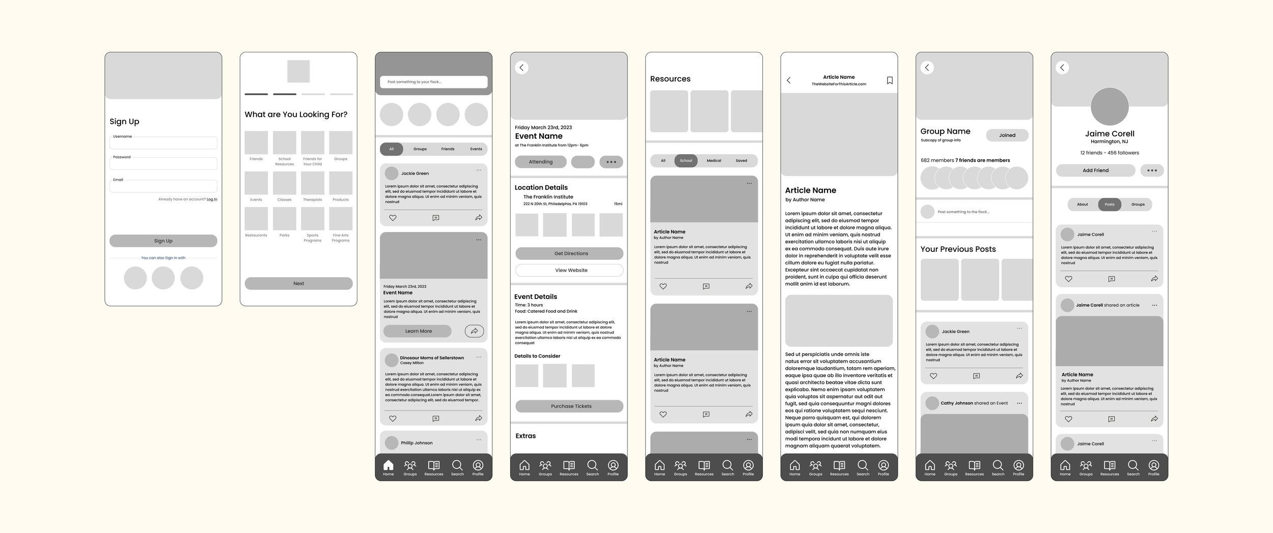
Low-fidelity wireframes, digitized from the sketches created
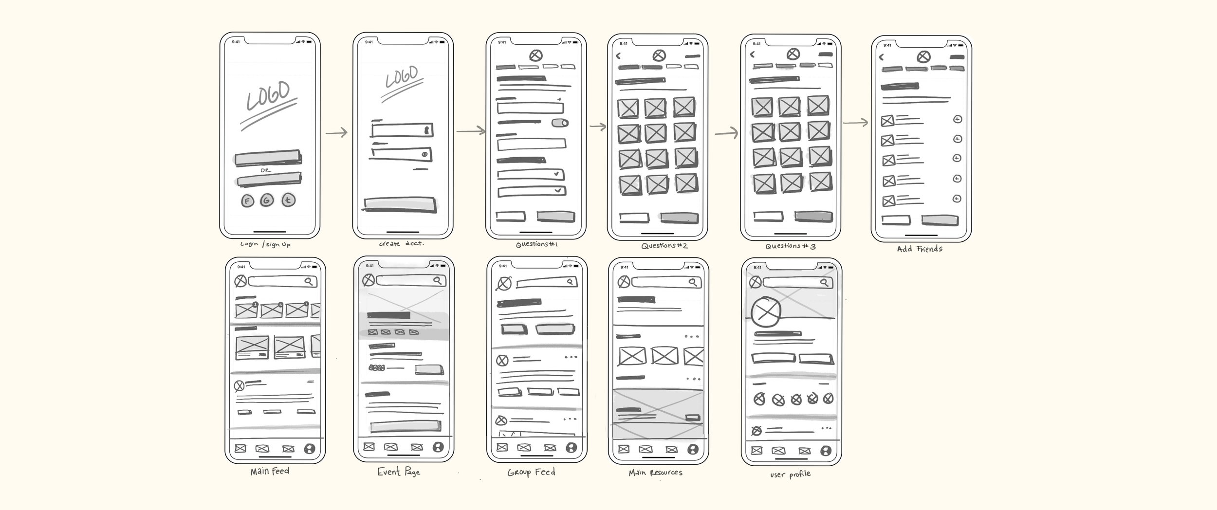
Sketches of app screen concepts
Branding & UI
The branding and UI of Flock needed to strike a delicate balance between playful, light, and approachable while also skewing more toward an adult audience.
Warm colors were used along with more rounded features to make it more inviting. While parents were the target market it was decided it should also be visually appealing to their kids as well.
These colors and styles ended up testing very well in early presentations and were only lightly modified.
Hi-Fidelity Wireframes
Once branding and UI were established, high-fidelity wireframes were developed, adding color and imagery while making sure to expand and iterate on patterns of hierarchy in order to clearly guide the user to important aspects of the experience.
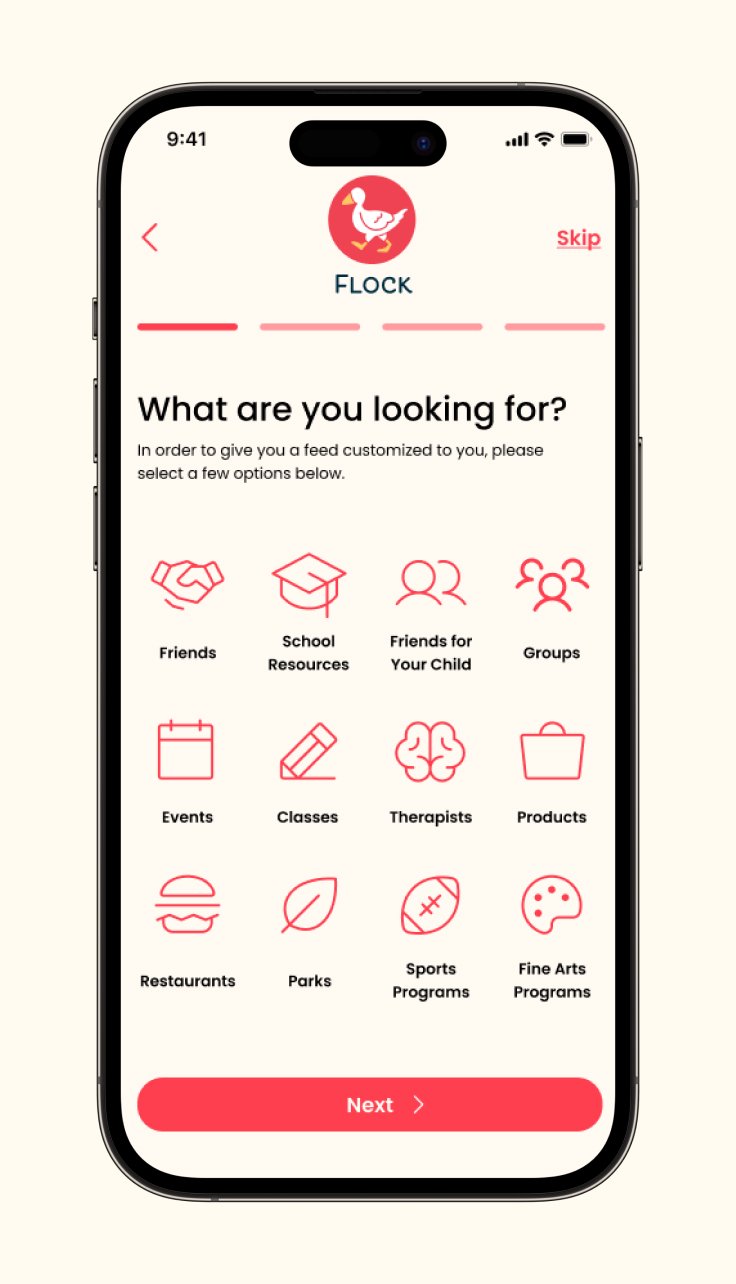
Onboarding Screen 1

User's Feed
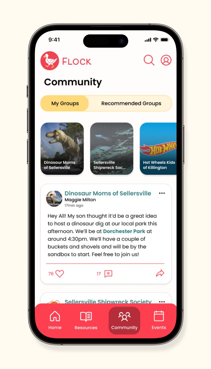
Groups Feed

A Group Page
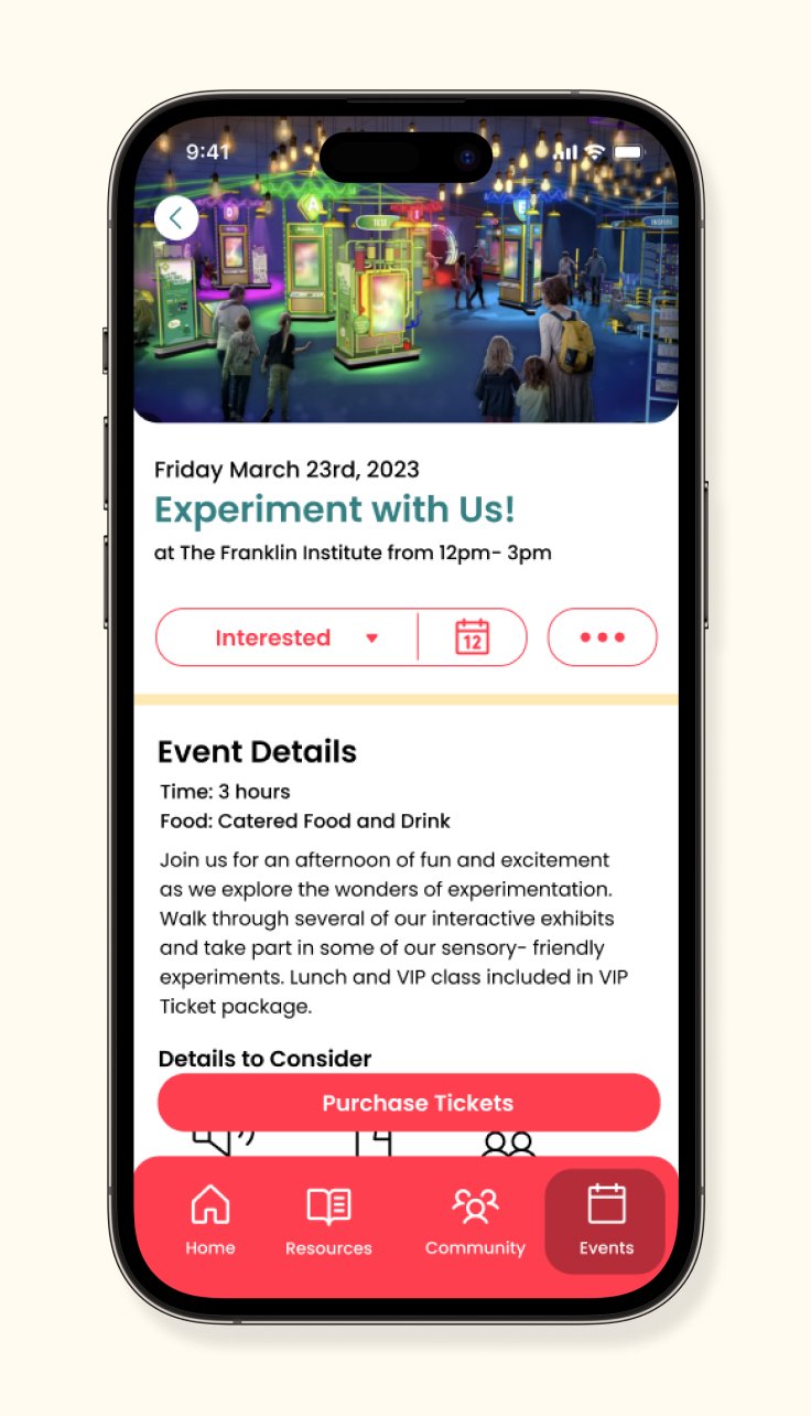
An Event Page

Events Feed
TEST
Prototype & Testing
Usability Testing
Over several days, 4 individuals participated in user testing of the Flock prototype. Of the four, two were in the user demographic while the other two fell outside of it.
Key Takeaways
All individuals found the flows and the UI familiar and intuitive due to experience with other social media apps.
Users enjoyed the color palette and playful nature, of the presentation.
“Warm” was a word frequently used.There was confusion navigating the flows involving groups due to some interchanging labels.
Several users expressed a desire to see some of the sensory details on the
main cards of events before clicking on the main page.
ITERATE
Updates
Consistency in Naming
Several of the users had trouble navigating to the requested Group’s page. Therefore, the first update was to remove confusion over Community vs. Groups by renaming the section Groups based on user feedback and further questioning.
Adding Sensory Icons to Event Cards
The next update was to add some of the sensory consideration icons to the main event cards seen across the app experience. Multiple users commented that while the icons were helpful within the Event page itself, having them present on the external cards would potentially help inform them before “wasting time on a click” only to see that an event is not a match for their family needs.
UP NEXT
Takeaways & Next Steps
Takeaways
This project, while extensive, gave me a great opportunity to experience the process of designing an app from start to finish. From concept to execution it was a fascinating and enjoyable ride.
I’ve found interacting with users and being able to listen to their wants and needs very helpful and refreshing, a departure from my graphic design days before.
It surprised me that people were less interested in “making friends” and more interested in using it for general connection. Future updates may modify the experience to cater to that.
Next Steps
I’d love to further iterate and explore a chat function as well as the ability to set up a “teacher mode” for teachers and educators who’d like to use portions of the service.

