Disney+
Case Study
A new feature that allows you to quickly and easily curate a carousel with your current favorite properties.
Project Details
-
Role
UX/UI Designer, UX Researcher
-
Who's In the Party?
Myself with feedback from others
-
Length of the Quest
1 month (Feb-Mar 2023)
-
Tools
Figma, Miro, Maze
The Problem
Disney Plus has a very strong presence and streaming experience but people, especially caregivers of young children, have no way to quickly access a property that has just finished playing, or curate favorites in a simple, quick, and editable way on the home screen. This can cause issues with caregivers of children who repeat watch properties as well as users who have “comfort movies” they like to rewatch.
The Goal
The goal is to allow a user to easily save or pin favorites to an easily accessible place for later use.
The Solution
Create an experience that allows the user to easily access and curate frequently watched properties from their home screen and several other areas of the Disney Plus branded experiences.
DISCOVERY
Research
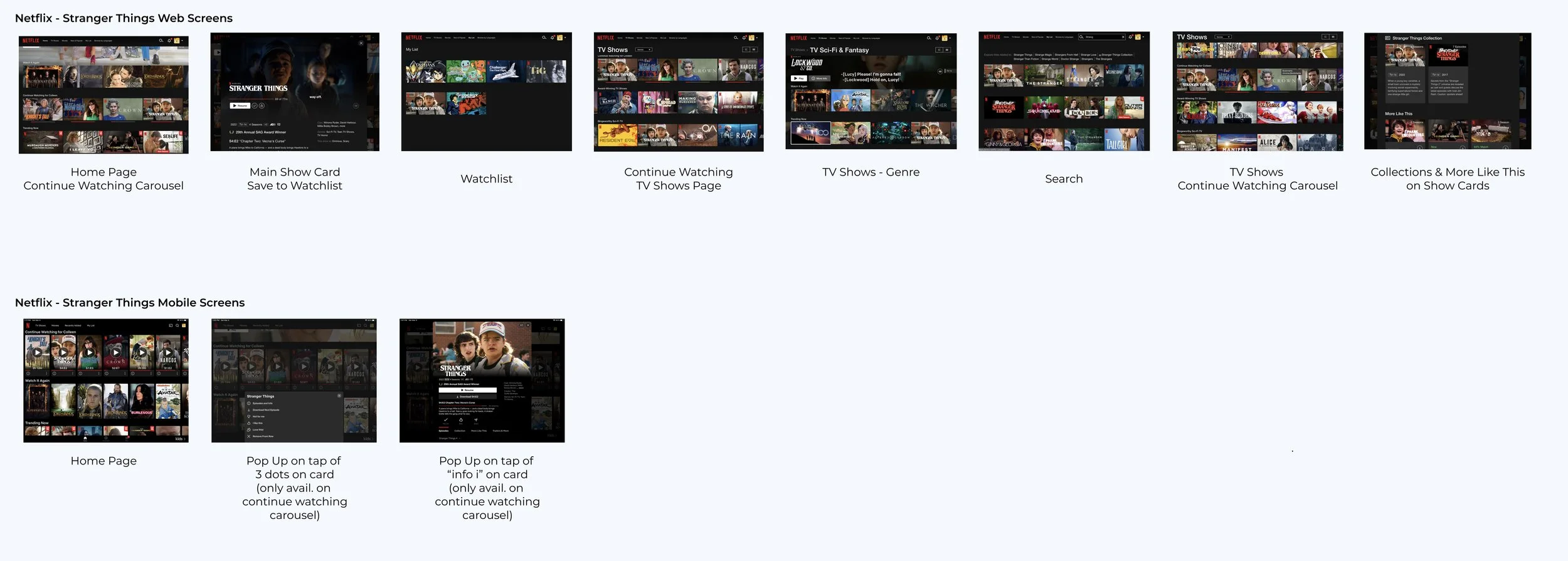
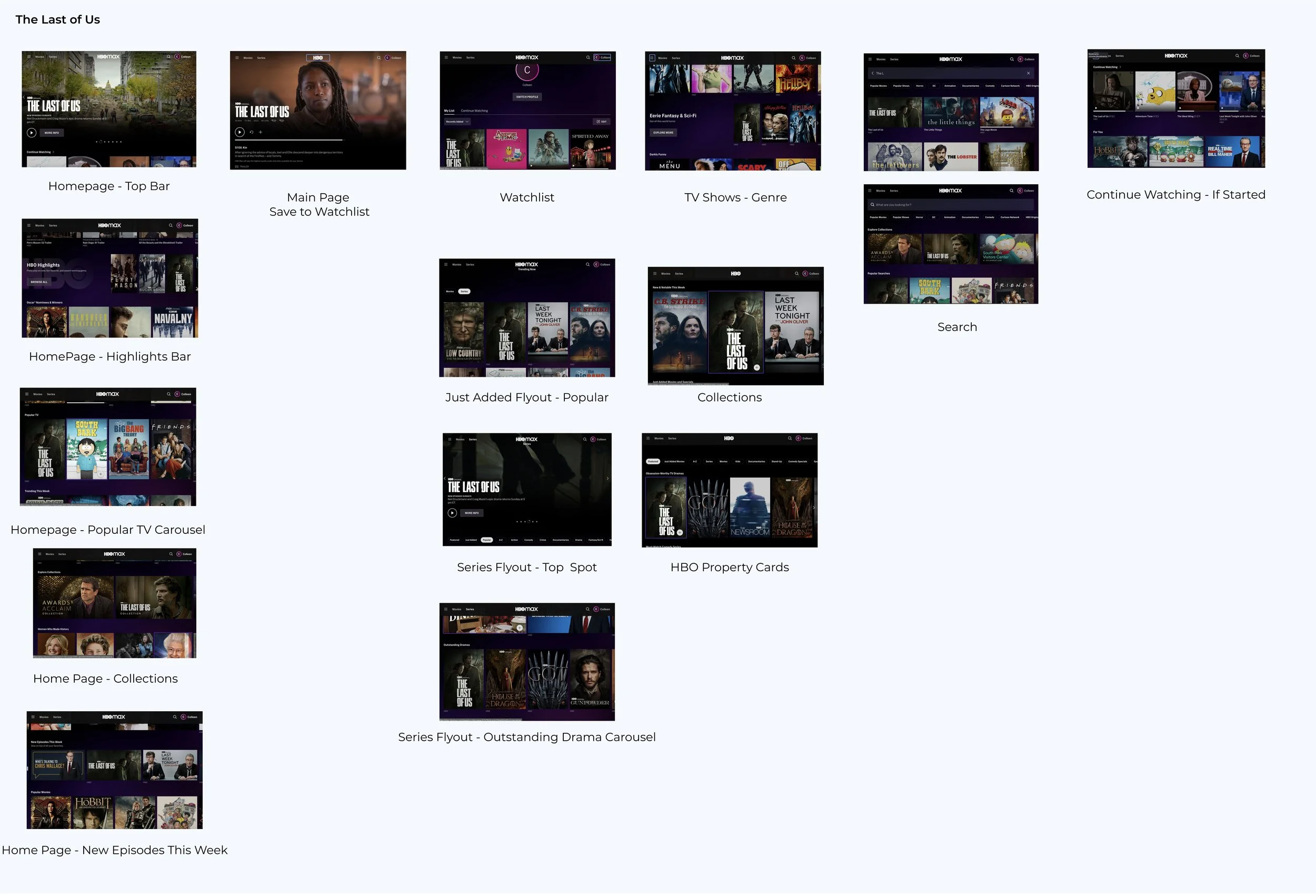
While Disney Plus was the focus of this project, I wanted to make sure I understood the landscape of streaming services and their experiences across multiple platforms. For this, I did an in-depth competitive analysis of Disney Plus and 4 of its competitors (Netflix, Amazon Prime, Hulu, and HBO Max). This included entry points and navigations to properties, as well as differences between web and mobile applications.
Competitive Landscape Analysis
Many functionalities on the web and mobile were the same with minimal differences between platform and property. However, both Hulu and Netflix had similar (but not exact) functionality as the feature I was aiming to develop for Disney Plus.
Qualitative Data - Interviews
Over the course of several days, I interviewed
8 participants to get a more detailed sense of the user not given by the survey answers. Of these individuals, 5 had children while 3 did not, and 7 had Disney Plus, while 1 did not.
Getting to Know the User
Quantitative Data - Survey
I also released a Google survey to social media. There were 25 responses to the survey, 19 had Disney Plus while 6 did not. There were also 18 of the users who had or cared for children while the remaining 7 did not.
Affinity Mapping
Having collected all the data from the interviews and surveys, patterns began to emerge regarding users’ pain points, wants, and various other insights. These were then mapped to gain a visual understanding of the information.
Key Takeaways
1.
Quick
Replay
Parents, especially of young children
find it extremely frustrating to have to
re-navigate to a movie/property once it is over, rather than having it easily accessible.
2.
Easy
Discovery
Several parents mentioned that they thought Netflix was easier for children to use, both in terms of UI and discovering new things they may want to watch.
3.
Where
Is It?
Another issue was that the “Continue Watching” carousel for properties in progress was not in a consistent location. It moves around frequently.
User Personas
Once all the data was collected and mapped, I created three user personas to represent the users that I interviewed. These personas helped me to keep the user at the forefront of my designs.
DEFINE
Understanding the System
In order to get a high-level picture of how the users currently interact with the screens and the paths they take to accomplish tasks, screen flows were created for both the current web and the tablet experiences using Kasey as the persona navigating.
DESIGN
User Interface
Sketches
After a preliminary round of sketching, selected screen concepts were moved into Figma and developed further with greater consideration given to sizing and hierarchy.
Hi-Fidelity Wireframes
Using the established Disney Plus branding and UI, high-fidelity wireframes were developed, adding icons and imagery while making sure to expand and iterate on patterns of hierarchy in order to clearly guide the user to important aspects of the experience.
Home Screen Carousels
Current Experience (as of Feb 2023)
Experience with Added “Favorite” feature
Property Page
Current Experience (as of Feb 2023)
Experience with Added “Favorite” feature
Watchlist Page
Current Experience (as of Feb 2023)
Experience with Added “Favorite” feature
TEST
Prototype & Testing
Usability Testing
Once the prototype was ready, a round of both moderated and un-moderated usability testing occurred. In order to see how the users navigated, 4 tasks were issued and various metrics were measured.
Almost all users found the experience intuitive and easy to use. They attributed this to the familiarity with streaming services in general.
Several users had difficulty due to the lack of clarity in the unmoderated task requests but noted so in feedback channels.
Two users noted the path they would normally take, the Search page, was not available to use but were able to navigate the prototype as is.
ITERATE
Updates
While normally the goal is to iterate on projects, the feedback from users supported that the additional feature and its navigation were generally intuitive.
However, one thing that the timeline did not account for was a full exploration of the experience of navigating through the Search page.
Two of the users mentioned that they would be more likely to find properties through a search function. Taking that note, I designed a screen to demonstrate what it could look like.
UP NEXT
Takeaways & Next Steps
Takeaways
In general, this is a feature that users are very interested in using. It is one that Disney Plus could develop relatively quickly and would have a positive impact on user engagement and act as a potential draw to new users.
If given the time, I would have loved to have explored the mobile and television experiences more and developed updates for those devices.
This project was a great way to test different methods of research and go more in-depth with synthesis using a focus on different products and platforms. The task of keeping modifications in the realm of the existing UI brought a challenge that was fun to solve.
Next Steps
Moving forward, I would love to develop and test the Search pathway for the experience. As well as continue to research and concept possible solutions for the mobile and television experiences.

